
• December 30, 2006 •
Indepth Review of Windows Vista.
Part IV: Windows Vista User Interface
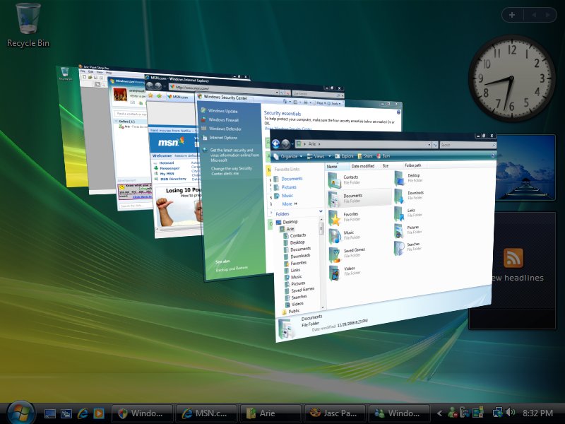
By: Arie SlobWhen you log into Windows Vista for the first time, you'll get your first view of the reworked user interface. Depending on the capabilities of your graphic card (assuming you did get any other Vista version than Home Basic), you'll either get to see the Windows Vista Aero interface (Figure), or the Windows Vista Basic interface (Figure).
|
|
|

If your hardware is capable of running the Aero user interface I suggest you stick to that, rather than to run the Basic UI. Not only does Aero look better, it also takes advantage of your graphic cards processor, so it performs better and is more stable than the Basic UI, which uses software rendering only.
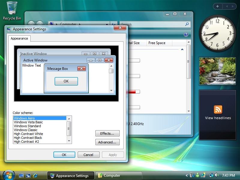
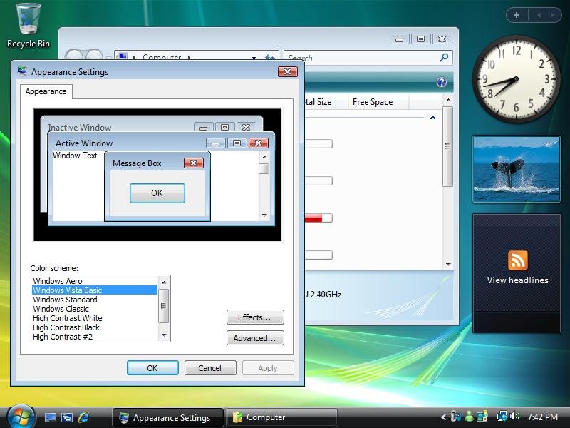
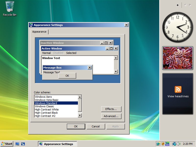
Microsoft has also chosen to include the Windows Standard / Classic UI choices, which resemble the Windows 2000 UI (Figure). I have only one advice: stay away! Hopefully Microsoft will remove those choices from Vista in a future release. Due to the many changes in Windows Vista these UI choices will present you with an ugly and inconsistent UI (Figure).
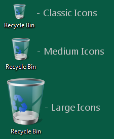
Microsoft also improved the scalability of the UI, which greatly improves Vista when used in high DPI settings, which in turn will help users who have problems with their vision or when using Vista on high-resolution displays. Vista can scale up its interface as well as non-DPI aware applications to 144 DPI. To this end, Microsoft has updated all icons in Vista to a new standard of 256x256 pixels. You can select the size of the icons displayed on your desktop in three varieties: Classic Icons, Medium Icons, and Large Icons, and no matter the size, the icons will look beautiful (Figure).
Windows Sidebar
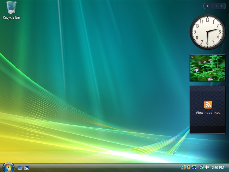
The Windows Sidebar is enabled by default, and takes up residence on the right side of the Windows desktop (Figure). The Windows Sidebar we see today is different than the one that was first included in early beta builds of Vista ("Longhorn" at the time), when it was envisioned to be a place to display system, services and application notifications. The current Sidebar is basically a 'container' for small applications (called 'Gadgets'), many of those will interact with Web services (think of clocks, weather and news applications). You can change the Sidebar to display on the left side of your screen, and if you have multiple monitors, you can choose the monitor on which Sidebar is shown. You can also choose to keep the Sidebar on top of other Windows, which in effect makes the Sidebar's inner edge the edge of your desktop (Figure), which works best of you have a 17" or larger display. Windows Vista ships with a number of Gadgets (including clock, calendar, and weather), and you can download additional Gadgets from the Live.com Web site.
Taskbar & System Tray
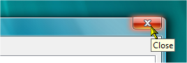
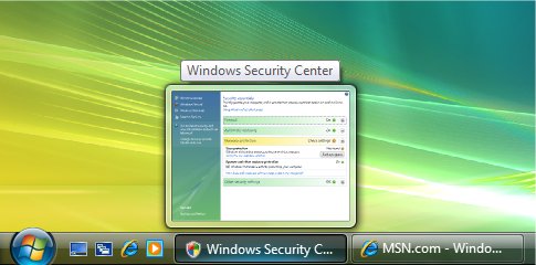
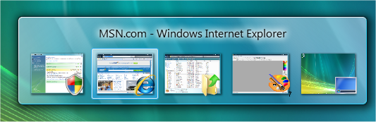
The taskbar in Windows Vista hasn't changed much from previous Windows versions. One improvement that Microsoft has made is the addition of "Live Taskbar Thumbnails" (Figure). As indicated by the name, these thumbnails are "live", meaning that the thumbnail will always have the latest information from the application running. No more guesswork if a Web site has loaded, or an application has finished processing, you'll be able to check from the thumbnail without the need to switch to the window.
Live Taskbar Thumbnails are only available when running the Windows Aero interface.
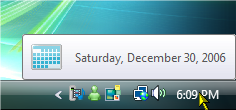
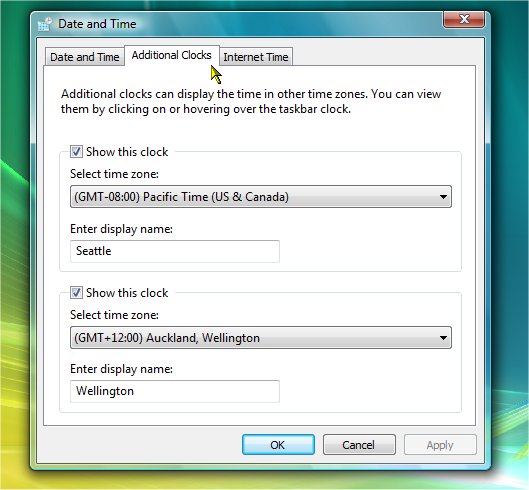
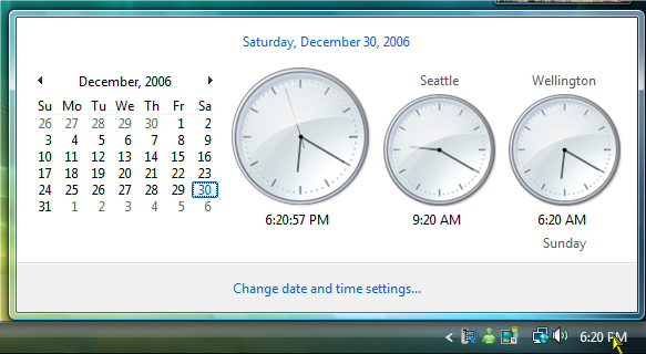
The System tray itself hasn't changed much either, but the system clock located in the system tray has had some nice updates. When you mouse over the clock, you'll notice a pop-up which displays the date (Figure). If you single-click the clock, you'll get a pop-up which displays a monthly calendar view combined with an analog clock display (Figure). If you click the displayed link to "Change date and time settings", you will notice that you can add up to two additional clocks (using different times zones) (Figure).
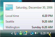
Adding additional clocks will both change the mouse-over display view (Figure), as well as the display that shows when clicking the date (Figure).
Windows Flip
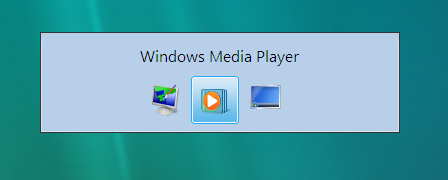
Windows Flip is the name Microsoft has given to the task-switching mechanism we're used to from previous Windows versions using the ALT + TAB keyboard keys. Like Live Thumbnails, Windows Flip also displays live thumbnails of running applications/windows when running in the Windows Aero UI (Figure). When used under the Vista Basic UI, Windows Flip looks like the old Windows XP 'ALT + TAB' combination (Figure).
Windows Flip 3D
 The 3D addition to Windows Flip adds a new dimension to scrolling through your open windows. It is activated by either pressing the Windows Key + TAB on the keyboard, or clicking the "Switch between windows" icon on the Quick Launch toolbar. Windows Flip 3D does give you a slightly better overview of your running windows, and you can use the mouse to click on any window in the 'stack' to switch back to a normal desktop view with the window you selected brought to the front. Like Live Taskbar Thumbnails, Windows Flip 3D displays the windows content 'live' and is only available on the Windows Aero UI.
Start Menu
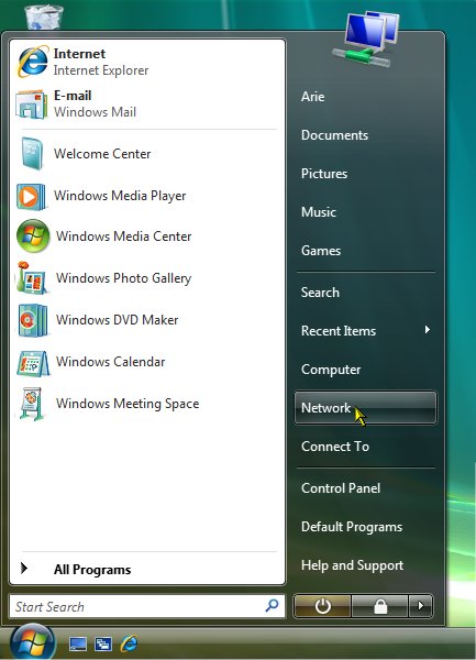
While the Start menu in Windows Vista resembles the Windows XP Start menu, its functionality has changed considerably. You'll first notice that the left side of the Start menu - where Windows shows the most recently used applications - has been increased in size to use about 2/3 of the width of the Start menu. To reduce the width of the items listed on the right side of the Start menu, Microsoft removed the icons from the descriptions. When using the Windows Aero interface, the icons now appear at the top of the Start menu, sticking out over the top of the menu (Figure) (when using Aero Basic, the icon will just appear at the top inside the Start menu).
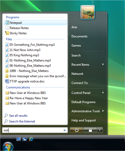
You'll probably also notice a search box built into the Start menu which integrates with desktop search through a new feature called Instant Search which can help you find and launch almost anything on your PC. Just type in a word, a name, or a phrase, and Instant Search can find the right file or application for you. As you type each letter, the list of results displayed is immediately constrained to those that match your search string, displaying the list on the left side of the Start menu, replacing the "recently used" programs list that normally displays on the left side of the Start menu (Figure). I'll discuss Instant search in more detail a bit later.
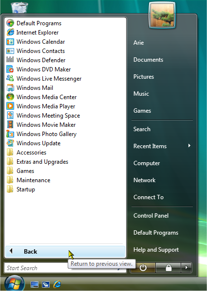
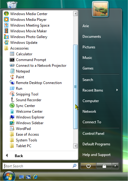
Next thing you'll also notice is the new behavior when you click the "All Programs" link. It no longer expands a sub menu, but instead the "All Programs" sub menu is displayed in place of the "recently used" programs list that normally displays on the left side of the Start menu (Figure). If you click on a folder, the list expands to show the contents of that folder, which can trigger the appearance of an in-place scroll bar if the displayed list gets too long (Figure).
Give your comments on this article.


